The Access Fund
Design: Non-profit branding, logo design, advertising, print and web media.
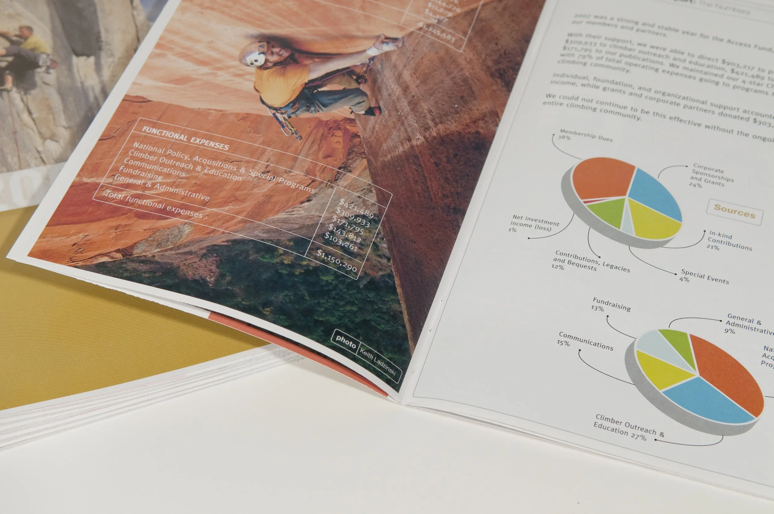
Projects: Logo design, advertising, branding, print, and web communication. Modernized logo re-design and brand color palette development, print advertising, annual reports, magazine design, and email campaigns.
Title: Art Director
The "protecting your access" ad campaign was focused on the organizations ability to protect access to lands for climbing. A bold clean design and typography was used for impact and clarity. I also sourced the images that had a sense of place and dramatic lighting. The "be a member" ad campaign focused on increasing membership. Black and white portraits of famous climbers, who were also members, were used to provide a human connection to the viewer and symbolized the individual member. Black and Orange were standard colors used throughout the organization's literature. The colors provided a bold and powerful accent to the ad.